
Tuesday, April 18, 2023
05:37 pm
PLATE OR NO PLATE? THAT IS THE DILEMMA
The time has officially come to talk to you about one of the most controversial issues in my life: the choice of the logo printed on a yellow background. If you are reading this page, you most likely already know BiMOR, so I will skip the general introduction on the birth of the brand to focus directly on the explanation of the choice of yellow.
YELLOW IS (ALMOST) EVERYBODY'S HAPPY COLOR :)))
To explain it in more academic terms, I report here an interesting analysis of the colors of our brand made by our first intern Matilde Marangoni (hi Mati <3) for the development of her thesis on BiMOR:
1. Brand positioning analysis through the Needscope model
In order to show the positioning of BiMOR I will use the Needscope model:
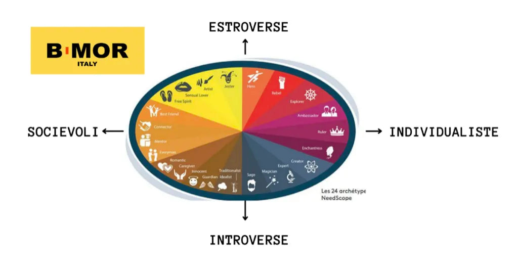
The brand is distinguished by two key colors: a bright yellow and an intense orange. Yellow represents energy, extroversion and creativity, associated with personalities who love originality, fun and adventure. The related archetypes? The Creative, the Lover, the Jester and the Explorer: brilliant minds, free spirits and curious souls always looking for new stimuli.
Orange balances this dynamism with stability and security. It is the color of trust, inclusion and harmony. Here we find the Wise and the Innocent, figures who embody rationality, sensitivity and a sense of authentic connection with the world.
These colors are not just aesthetics: they define the way the brand communicates. Yellow brings a direct, fresh and engaging language, while orange transmits clear, honest and accessible messages, creating a sense of belonging.
The result? A visual identity that combines spontaneity and balance, energy and reliability, always with a touch of authenticity.
As can be seen from this careful analysis, yellow is truly one of the colors that most symbolizes positivity, joy and energy.
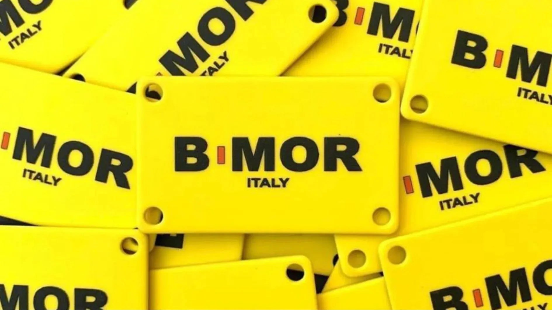
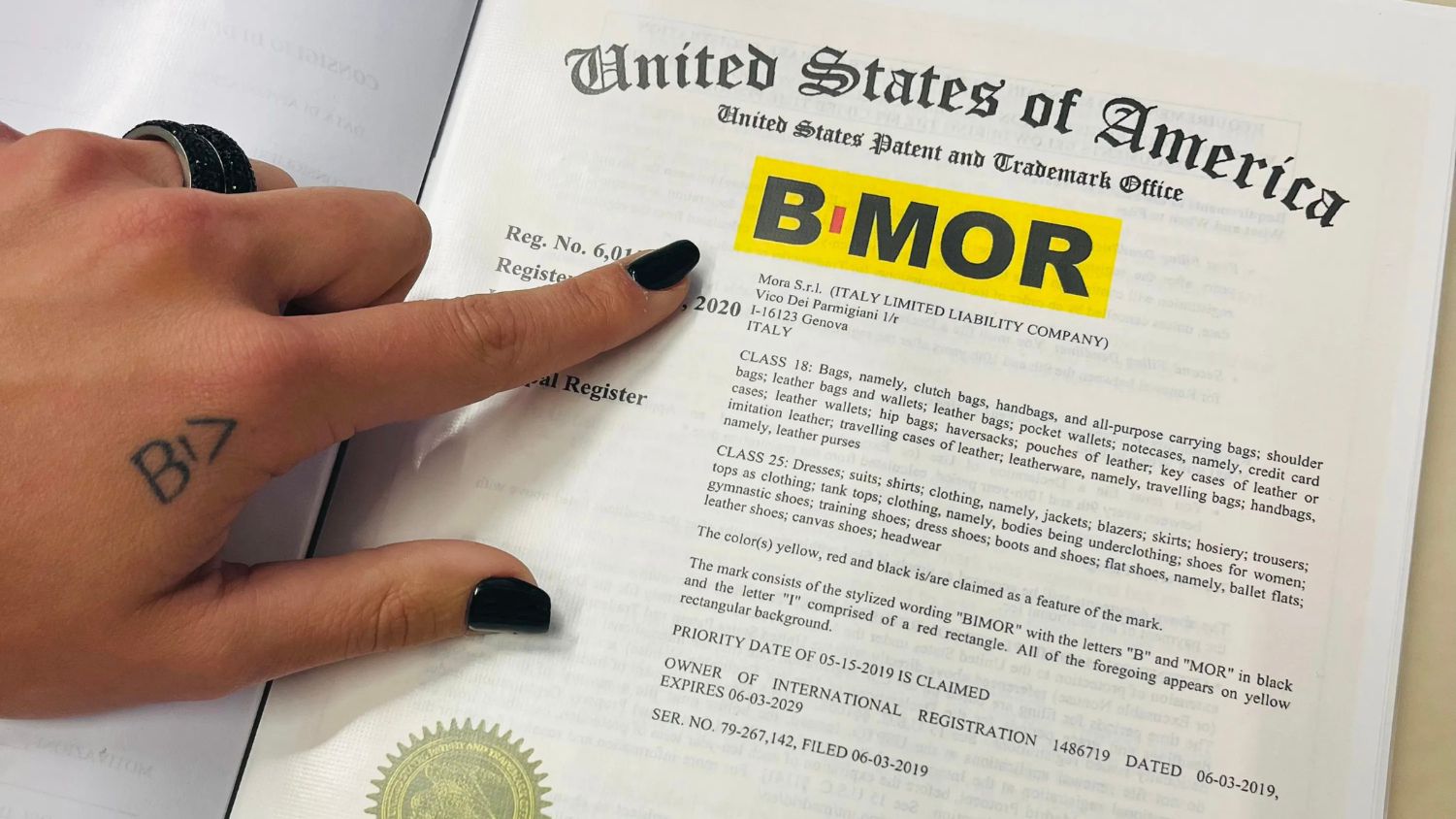
This is what we thought when we decided to choose it as the symbolic color of our brand - so convinced that we also registered the trademark in the United States with a yellow background attached:
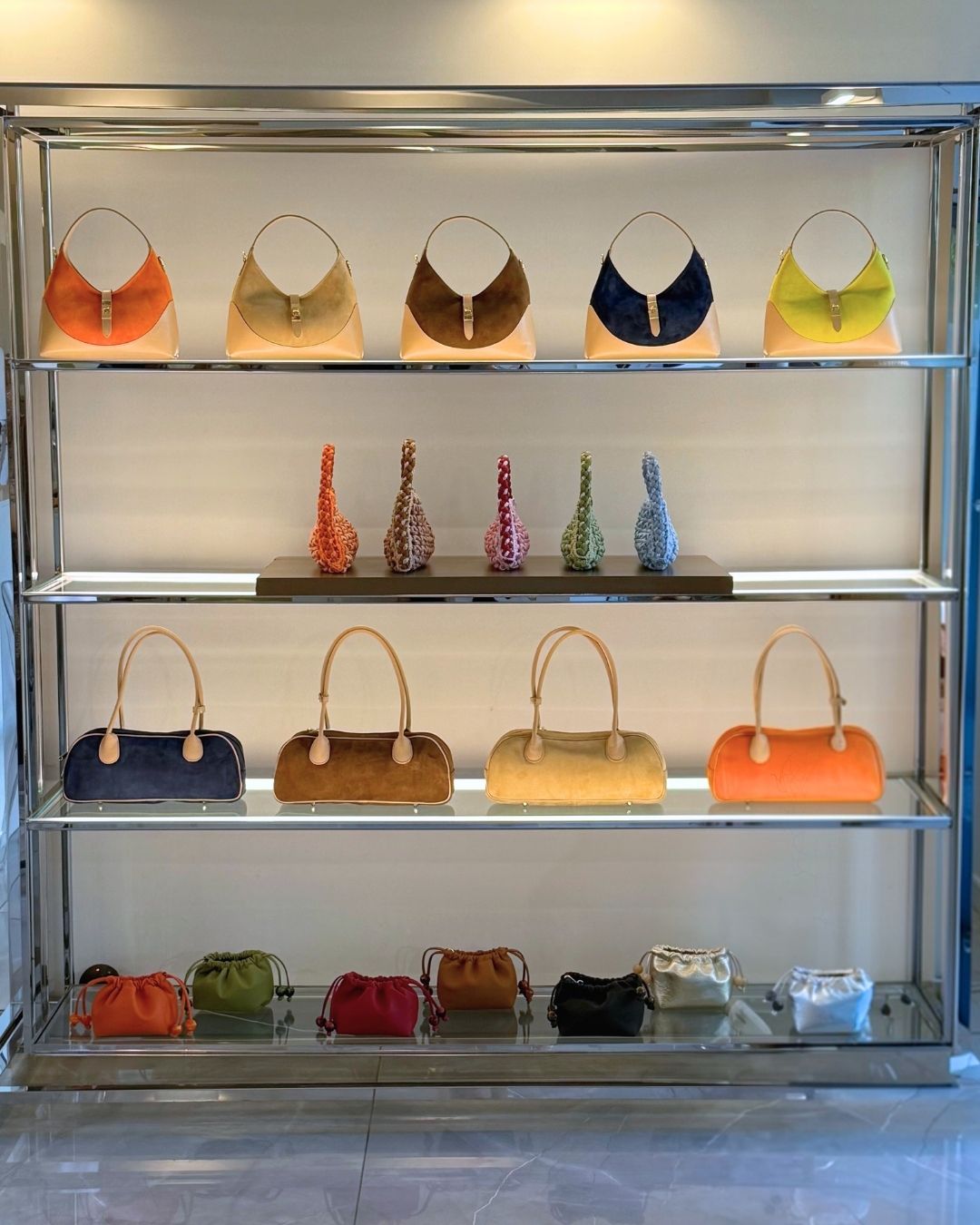
...and that's why almost all of our bags feature the BiMOR logo applied on a shiny, ultra-flashy and super-colourful yellow metal plate: an accessory that cannot go unnoticed, and that's exactly the point!
As I approached the world of B2B distribution, I often heard people say that it is too obvious a logo, which according to some even ruins the aesthetics of the bag. For a moment I almost convinced myself that they were right after all, but after thinking about it, I remembered the main reason that led me to choose it: my enthusiasm.
Enthusiasm to choose to see the positive in everything. To believe in my ideas, carry on with this project and share my message.
Making each BiMOR a symbolic object to share with the world as a representation of positivity, light and energy.
The BiMOR plaque contains all of this: the soul of our products and the cornerstone of our brand identity.
The years will pass and from the plate we will move on to the zip slider, the shoulder strap, the detail or who knows, the only certain thing is that the yellow will always be there. Take it or leave it.
So sorry, but I'm not really sorry:)))
With much love,
Bi>
#AlwaysBiMOR
MOR RECENTLY:

Apparently, manifestation really works.

OUT WITH THE OLD IN WITH THE NEW
If 2025 has taught me anything, it’s that people truly make the difference.
NEED HELP?
We're here for you :)